Three-tier network
What does a typical three-tier network look like?
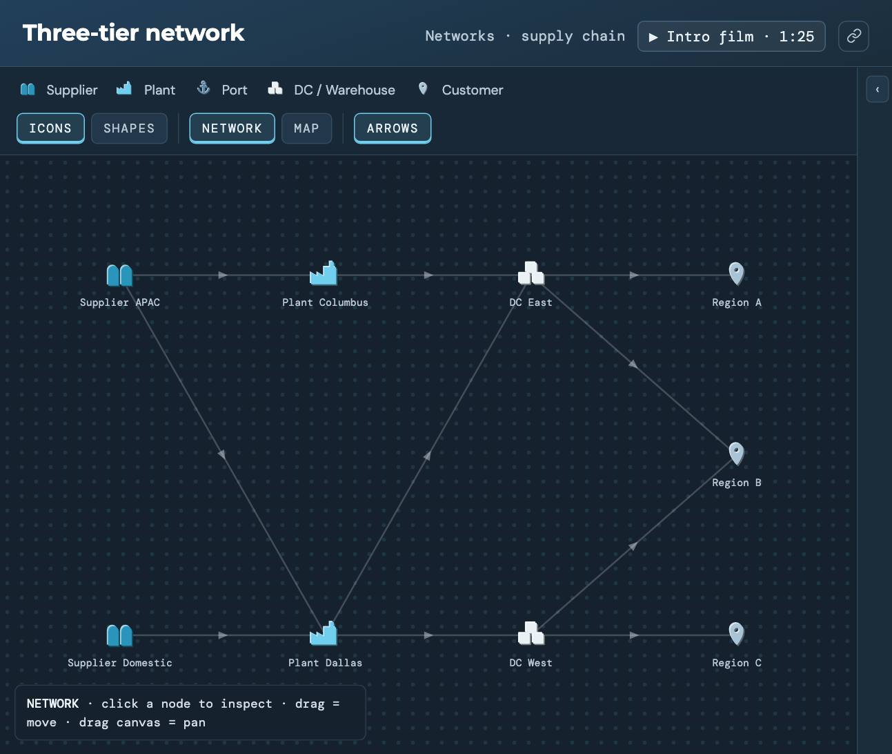
Two suppliers, two plants, two DCs and three customer regions. It’s the shape most network studies start from, laid out so you can click every node and lane.
The question it answers
How do the tiers of a network connect, and what does each lane mean? Here an overseas supplier and a domestic supplier feed plants in Columbus and Dallas. The plants feed DCs in Atlanta and Reno, and those DCs serve three customer regions. Some lanes overlap on purpose, so a region can be served from more than one place.
What you’ll see
The network drawn as a graph, and on a map when you switch to MAP. Click a node to see its record and the lanes in and out of it. This demo is structure only. Nothing runs, so there are no results to read, but it’s the layout a model would start from.
What to change
- Click each plant and follow its lanes to see which DCs it can supply.
- Switch between NETWORK and MAP to see how the graph sits on real geography.
- Ask the assistant when another tier is worth adding, or why two plants rather than one.
Where it leads
Once the structure is agreed, the next questions are where the DCs should be and how many you need. DC placement and Greenfield · US take those up.
Run Three-tier network
It opens in the Sandbox with sample data. No signup, no install.
Run it →Or see all eleven network demos.