The ReliaSim Method

From production graph to confident decision

How ReliaSim turns a production graph into an OEE prediction accurate within 1% of your real line. No simulation expertise required.

Build
Step 1
Validate
Step 2
Predict
Step 3

How do you increase production?

Every system has multiple ways to improve.

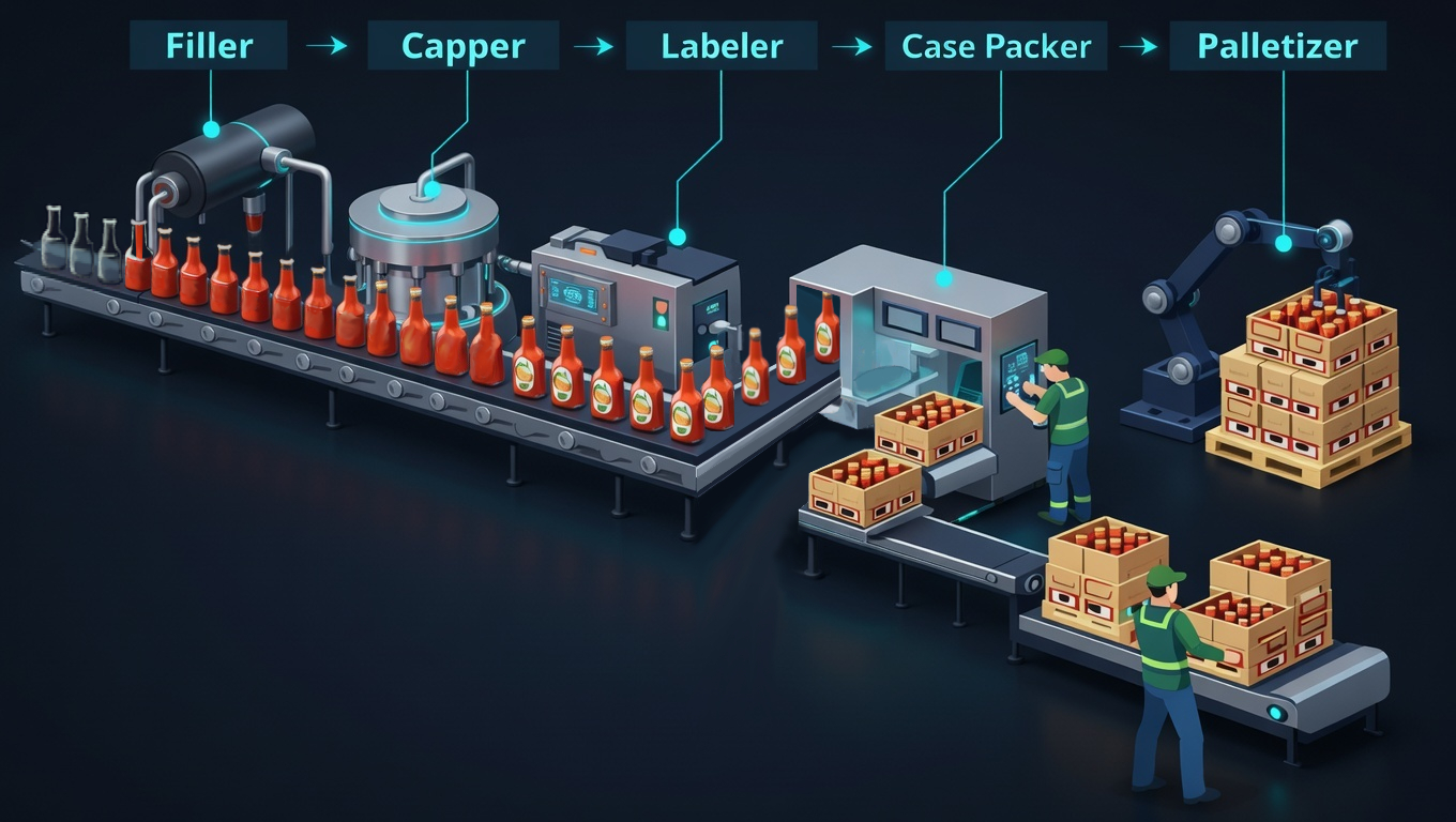
A bottling line — Filler, Capper, Labeler, Case Packer, Palletizer
Add Buffer?
Improve Reliability?
Automate the Process?
How do you decide?
Gut feel?
Spreadsheets?
Past experience?
Consultants?

Or — you model the system, parameterize from real data, and predict which lever pays off before you pull it. That's the three-step sequence below.

Step 1 · Build

Sketch what is. Parameterize what matters.

Draw your production graph node by node. Set rates, mark buffer positions, and compose each machine's behavior from historian data or reliability shapes.

So that your model reflects the real system from day one.

Step 1 · Build → Sketch what is.

Draw your production line node by node. Set rates, add buffers, mark decoupling points.

Duration: 90.00 Days Efficiency: 100.0% PerfectProduction: 130,896 pallets
BufferBulk Storage
ConverterFiller A
ConstraintCapper A
ConstraintLabeler A
ConverterFiller B
ConstraintCapper B
ConstraintLabeler B
ConverterCase Packer
ConverterPalletizer
BufferWarehouse
See it in action — model build video
Drawing the production graph — block by block

Step 1 · Build → Parameterize what matters.

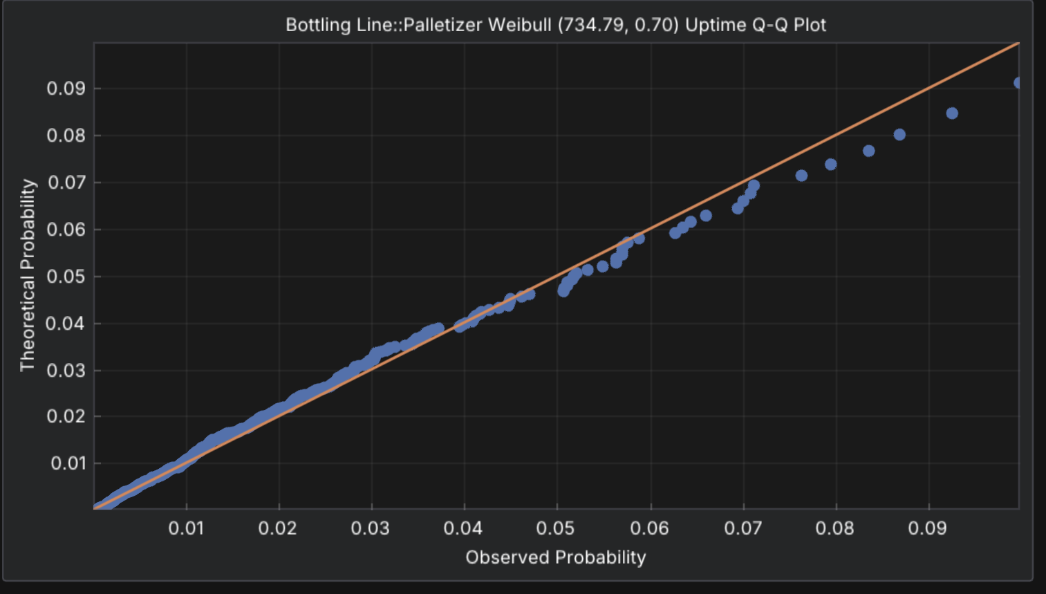
Feed historian data to ReliaStats to find the right failure distributions.

TTF / TTR distribution designer
TTF — Uptime TTR — Repair Time (min) → PDF ↑
Source-to-fit — distribution matching
Q-Q plot

For new systems, the Interrupt Designer lets you choose distribution shapes manually.

Infant Mortality
Decreasing failure rate
Wear-out
Age-related failures
Scheduled
Fixed-duration maintenance

Step 2 · Validate → Validate against history.

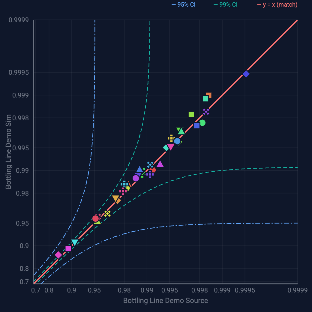
Compare to your historian. Each point is an interrupt. On the diagonal = model matches reality.

Model vs. historian — simulated availability vs. actual
Interrupt Validation scatter — source vs. sim availability with 95% PI and 99% CI bands

Each point is an interrupt. On the diagonal = model matches reality.

"The only way to predict this accurately is through simulation."
— Tom Lange, 36 years Procter & Gamble

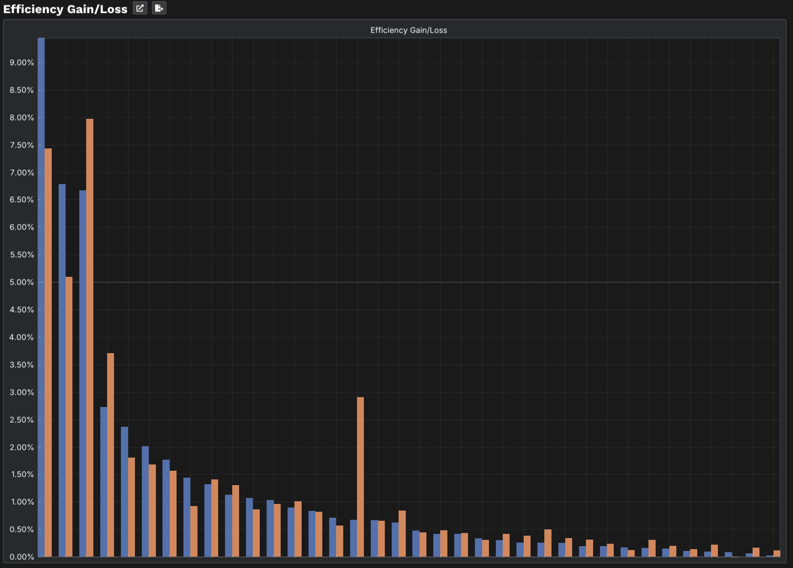
Step 3 · Predict → GainLoss.

Each machine is an actor with its own rhythm. When the ensemble performs together, blocking and starving emerge from the interaction.

Efficiency Gain/Loss chart
Loss → Gain detail
8.00% 7.50% 7.00% 6.50% 6.00% 5.00% Labeler Filler Loss Gain
Labeler Misalignment
Loss 6.78% → Gain 5.10%
0.75×
recover less than you lost
Filler Micro Stop
Loss 6.67% → Gain 7.97%
1.2×
56% more recovery

Same loss. Completely different recovery.

Get Started

Now see it on your line.

Three ways to start — explore on your own, see it live, or scope your system.

Download Player Book a Walkthrough Schedule a Scoping Session