Which Loss to Fix First
The Biggest One Is Rarely the Costliest
The Six Big Losses give you a complete inventory of where production goes. They don’t give you an order. Almost everyone ranks them by minutes lost, and that ranking is usually wrong.
The inventory is the easy part
The six categories come out of TPM and cover the full range of losses: equipment failure, setup and adjustment, idling and minor stops, reduced speed, process defects, and reduced yield at startup. Mapped onto OEE, the first two land in Availability, the middle two in Performance, and the last two in Quality.
Most plants can produce that breakdown from their event data in an afternoon. Then the improvement meeting starts, someone points at the largest bar, and the budget follows it, which is where the money gets misdirected.
Why the biggest loss is usually the wrong target
There are three reasons, and they compound.
Losses aren’t independent
A loss inventory adds minutes as though each stoppage cost the same, and they don’t. Ten minutes of downtime on a machine feeding a full buffer costs nothing at all. The same ten minutes on a starved constraint costs ten minutes of finished product. The report records both identically, so the ranking it implies is a ranking of occurrence, not of cost.
Position matters more than magnitude
Where a loss sits relative to the constraint decides whether it matters. A large loss on a machine with slack either side may be almost free. A small, frequent loss on the constraint is paid in full every time. Two plants with identical loss tables and different topologies have different correct answers.
Averaging erases the difference
This one has been observed in print. Fischel and Lange modeled a food plant with over twenty unit operations and up to twenty failure modes each. They noted that had they taken the conventional averaged, single-failure-mode-per-operation approach, "the gains and losses would be less accurate and essentially identical to each other."
Coarse loss accounting doesn’t just blur the ranking. It flattens it until every candidate looks about as good as every other. Then the decision falls to whoever argues most confidently, and the analysis has added nothing.
The ranking that actually holds
The question you want answered isn’t "how many minutes did this cost?" It’s "how much production comes back if I remove it?" Those are different numbers, and only the second one justifies a budget.
A model answers it by subtraction. Take the validated line, remove one failure mode, re-run, and read the difference in output. Repeat for every failure mode. You get a ranking by recoverable throughput. It accounts for position, for interaction, and for the buffers that absorb some losses and not others.
Two rankings of the same line
| Ranked by | What it measures | What it misses |
|---|---|---|
| Minutes lost the loss report | how often and how long | whether the line noticed |
| Recovered throughput remove it and re-run | what you get back | nothing, since it’s the answer |
Both numbers, side by side
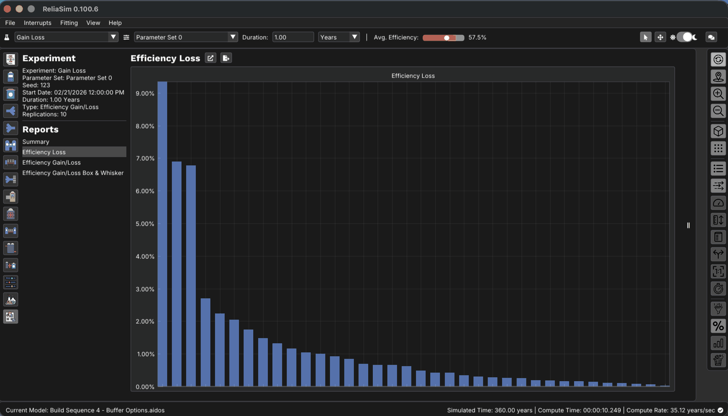
Start with the ranking you already have. The Efficiency Loss report is a Pareto of what each failure mode cost. It’s the same shape as the loss tree on your wall, and just as persuasive.
Now put the recovery beside it. The Efficiency Gain/Loss report keeps the same order and the same blue loss bars, and adds an orange bar for each, showing what the line actually gets back when that failure mode is removed.
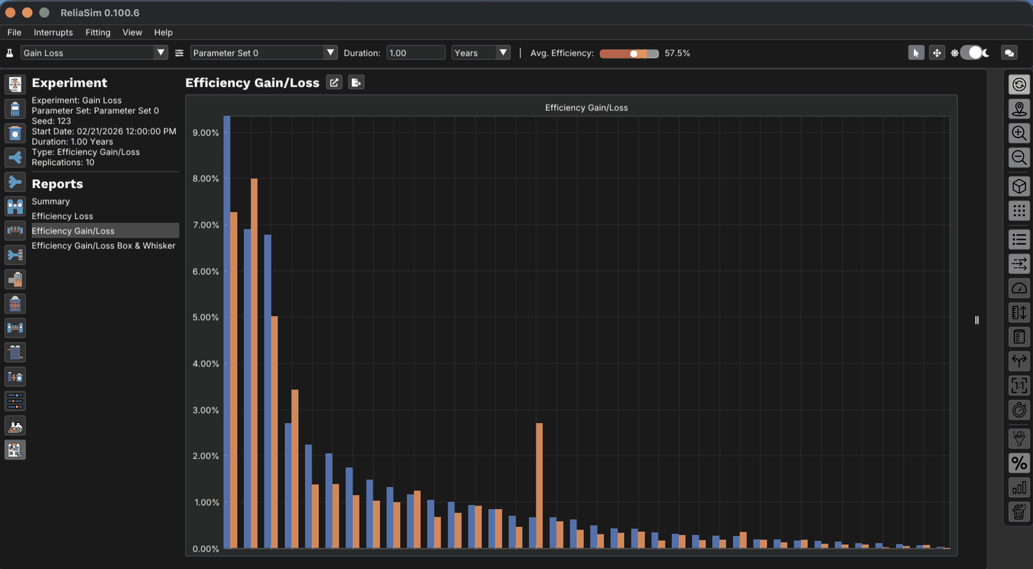
Hovering any pair names the failure mode and both figures, so the disagreement is readable one at a time rather than inferred from bar heights.
Labeler::Labeler_Misalignment: Loss 6.67%,
Gain 4.85%. Those aren’t the same number, and across the chart they don’t rank in the same
order. This whole 90-day Gain/Loss sweep on the Buffer-Options line runs 88.77 simulated years in 2.8 seconds.The counterintuitive ones
Exhaustive sweeps surface findings that nobody nominates in a meeting:
- Frequent short stops beat rare long ones. A stoppage measured in seconds looks negligible on a loss report. On a tightly coupled line it never lets buffers refill, so its cost is carried continuously rather than occasionally.
- Faster isn’t always more. Raising line rate raises failure rate too, so throughput has an optimum rather than rising steadily. The Fischel and Lange study found exactly this, and any analysis that treats rate and reliability as separate can’t see it.
- Some losses are already absorbed. Fixing them returns nothing, because a buffer was covering them, and it’s better to know that before funding the project.
What this needs from your data
The ranking is only as good as the failure-mode detail underneath it. One lumped downtime figure per machine gives a flat ranking. Named failure modes from a Line Event Data system give one you can spend against. The bottling line demo models show both on the same line, and they give a different answer about where the bottleneck is.
Try it on a real bottling line: the Sandbox question What should we fix first?, or one move in Beat the Bottleneck.
See losses ranked by what comes back
The sandbox has saved Gain/Loss results that remove interrupts one at a time and show what the line gets back from each.
Open the sandbox → How the method worksWant to see it on a real line first? Read the case study or schedule a call.